Keystroke Flow from Chrome Omnibox
I take saved keystrokes from Chrome's Omnibox and graph them in a Sankey flow diagram.


The "Network Action Predictor" is an SQLite database that's long been part of Chrome (since Chrome 17) but hasn't gotten much attention. The (simplified) summary of its function is to help Chrome seem faster to the user by predicting the resources Chrome will need and preloading them. Kevin Pagano wrote a blog post that does a nice job introducing the artifact and covering the basic info about it. I won't cover the same stuff here, so check out his post for an introduction to Chrome's Network Action Predictor. His post gave me the little kick to dust off and polish (a little) a visualization I had been playing with for this artifact a while ago.
I've been interested in visualizations and applying them to digital forensics for a while now (some examples on the blog). When I was exploring the Network Action Predictor data the type of chart that came to mind was a Sankey diagram. A Sankey is a type of flow diagram. I think the best way to explain how it works is show an example. I came across this one a few years ago and it has stuck with me as an effective use of the visualization technique:
How 52 ninth-graders spell 'camouflage', Sankey diagram [OC] from dataisbeautiful
Each "node" (the colored bars) represents the number of items in that state and the "bands" (or "links") connect one node to the next. Both the nodes' and bands' sizes are drawn in proportion to their value. It's easy to see what spelling "paths" were the most common, see where they diverged, and how common each end state was. It's a ton of interesting information packed in a small area! I find myself tracing different paths, making comparisons, and just generally exploring it: all hallmarks of an effective visualization.
Below is the "Network Action Predictor" data as Sankey (after a little massaging; read on for the details). There isn't just one starting node (C in the spelling example above) as there were many different starting letters.
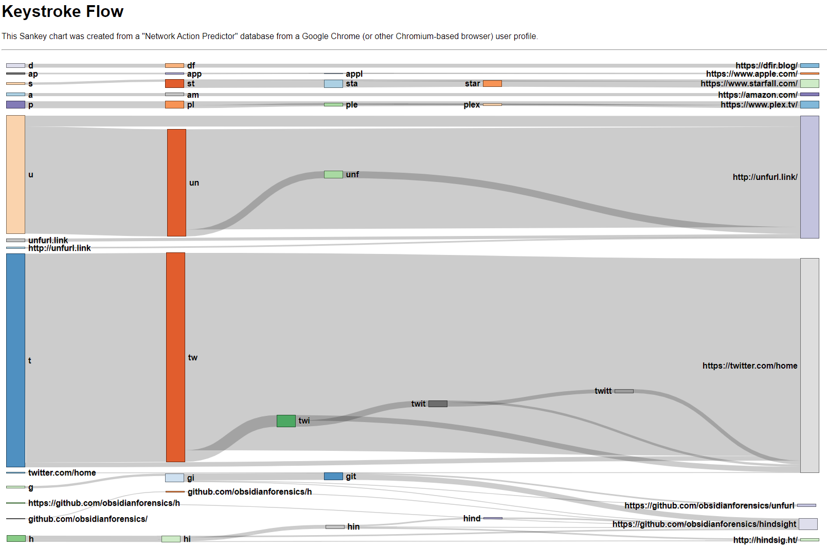
In the Keystroke Flow Sankey chart you can see a few different things (beyond that I visit Twitter way too much). When I visit Unfurl, I most often type un and then select the suggestion. I do the same with Twitter; tw then the suggestion. It's interesting that after seeing this in data, I came to realize I follow this pattern quite often when launching things: whether in the Windows Start Menu, Mac's Spotlight Search, or the Chrome Omnibox, I hit a shortcut (Windows key, Command+Space, or Ctrl+T, respectively) then the first couple letters of what I'm looking for.
The chart gets a little more interesting further down with the Github and Hindsight entries. I access two different Github repos and two Hindsight-related sites often; these all have some common starting places (g or h) and then diverge. The edges overlap and it's a bit harder to see (in the screenshot image at least; in the actual graph you can hover, highlight, and move nodes).
I think there's a couple things that could be of value in this artifact (or visualization). I find artifacts that show what a user actually typed have value, particularly with regard to user intention. After seeing the chart, it would be hard for me to argue that I only went to Twitter or Unfurl by mistake. Conversely, if you did find a visit to a site of interest in the Network Action Predictor data, found it was only visited once, and could see what the user typed to get there, that might help inform your opinion (for or against) as to if the visit was accidental or not.
I hadn't published this before as I couldn't see a good way to integrate it with existing timeline-centric tools (Hindsight, Plaso, or Timesketch) as there isn't any timestamp information in it. I've put it up in my scripts Github repository, kind of a catch-all for one-off scripts. I still consider the visualization to be in the proof-of-concept/prototype phase, but I thought someone might find it interesting or useful.
How to Build the Sankey Diagram
The data stored in the "Network Action Predictor" isn't quite in the format needed for a Sankey. The network_action_predictor table has user_text and url columns (among others), but that doesn't give us the "in-between" states (C → Cam → Camoflau → Camoflauge in the spelling example) and a Sankey without those is much less helpful. There are multiple ways to construct the intermediate states (using SQLite's rowid is one option), but the way I chose to approach it in my script is laid out below.
Filter
First, I wanted to filter out rows that aren't helpful for the visualization. I removed rows with number_of_hits == 0 (the 0-hit rows are quite numerous and are suggestions that were not correct) and rows where user_text == url (there weren't any intermediate steps; these are more rare). There also often are a lot of URLs that have only been visited a few times. These can make the graphic "noisy" so I added the ability to filter out any entries that are below a user-defined "threshold" value (2 by default).
Construct Nodes & Links
Next, I needed turn the rows of user_text, url, and number_of_hits values into nodes and links. I looped through all the rows and grouped the user_text entries by what URL they point at. This resulted in a dictionary for each URL with keys:values being user_text: number_of_hits . Example:
   'https://www.youtube.com/': {
       'y': 5.0,
       'yo': 5.0,
       'you': 3.0
}user_texts that point to same URLI then need to convert these into "link" form. Doing so on the same YouTube data as the above example yields these links:
 'y' -> youtube.com (5)
 'yo' -> youtube.com (5)
'you' -> youtube.com (3)network_action_predictor rowsNow there are many user_text entries all pointing to a URL, not to other text items. This would result in a graph that's only two "levels" deep, not the multi-leveled flow graph desired. I needed to modify the links so that user_text entries that eventually point to the same URL and that are subsets point to each other instead, showing the flow (and not lead to overcounting the end result); something like this:
  'y' -(5)-> |'yo'| ---(2)-------------------> | youtube.com |
|'yo'| ---(3)--> |'you'| --(3)--> | youtube.com |Important note: this is assuming something about the data; those 5 hits foryto youtube.com are actually the same 5 hits as foryoto youtube.com. I couldn't find confirmation that this is the case, but from looking at a bunch of different test data sets I've collected I believe it to be true. The alternative is that there actually was 10 hits to youtube.com (5 fromyand 5 fromyo), not the 5 I'm interpreting it as.
To transform these nodes and links into the "chained" form I want, I go through each URL's dictionary and see if any user_text values are the same, but with one letter added at the end. Examples: y & yo and yo & you. If so, made a new link ( y → yo ) with the "weight" being the overlap (5).
To wrap this part up, I made links for any nodes that didn't fall into this "subset" pattern, then did a little massaging to save the nodes and links in a JSON file suitable for the graphing library.
Display the Chart
To build the actual visualization, I used d3.js and a Sankey plugin. There are other Sankey options; this one is quite old, but I did start this project a long time ago. You can do incredible things with d3.js, but I am by no means a master with it and this chart is fairly spartan. It's mostly the example code with a few tweaks; most of the work I did was in transforming the Network Action Predictor data into a JSON in the format the library needed.
Run it Yourself
In my scripts repository, there is a keystroke-flow directory. Run python3 keystroke-flow.py "/path/to/Network Action Predictor" and it will create a JSON file. If you want to tweak the threshold value mentioned above, pass -t <number> to filter out URLs that have less than <number> incoming links. There's a keystroke_flow_diagram.html file in that directory that will render the JSON into the Keystroke Flow chart, but you can't just open it to view the results. If you do, you won't see the chart, as CORS policy won't let it load.
Fortunately, Python can help us out here. Open a command prompt and change directories into keystroke-flow. Then run python -m http.server, open http://localhost:8000/ in a browser, and click keystroke_flow_diagram.html to view your own Keystroke Flow Sankey!